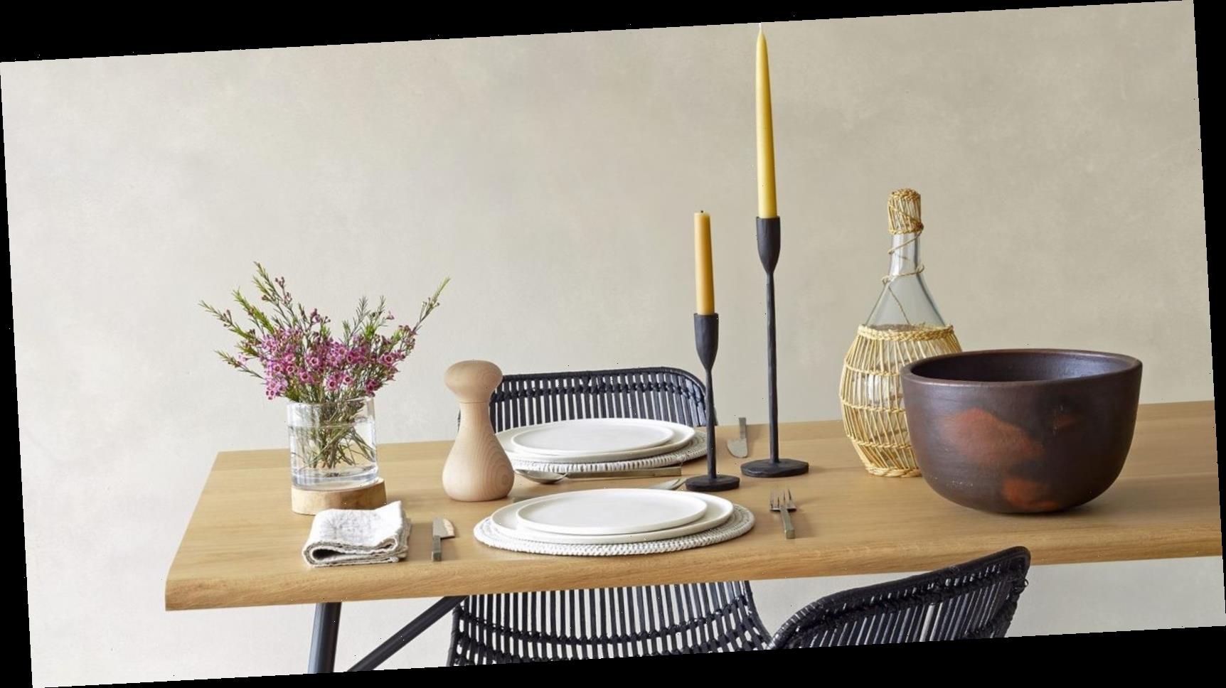
Japandi (Japanese and Scandi) interiors share a love of nordic chic and eastern zen. Here, Joanna Thornhill shows you how to blend the trends.
While all eyes are on Japan for the Tokyo Olympics, interiors tastemakers are taking inspiration from Japan too, blending it with the best of Scandinavian design to create ‘Japandi’. Despite the geographical gulf, there’s a cohesion between the two aesthetics that stems from a joint respect for beautifully crafted pieces and natural materials: the Scandi side favours a rustic twang while the Japanese element makes use of dark woods and sleek shapes.
Both styles are timeless and highlight the less-is-more approach to sustainability. Here’s how to Japandi your home this year…
-
NATURAL LOOK
Typically, Scandi style favours pale woods and equally pale settings, while the Japanese also incorporate nature-inspired tones: cool blues, earthy greens and sun-bleached clay. Use limewash or chalk-based paint on walls for added texture and to stop things feeling stark.
Materials generally derive from nature, too. Thanks to its ability to grow quickly, bamboo is an eco-friendly option. Choose organic linen over polyester, and terracotta or slate tiles over vinyl as their natural characteristics will bring through a visual softness. Washi – traditional Japanese paper – has long been a popular form of lighting in both countries as it gently diffuses and creates a cosy glow.
-
USE SILHOUETTES AND SHAPE FOR IMPACT
Simplistic certainly needn’t mean dull, and Japandi style highlights how nailing your shapes can turn a space from ‘meh’ to ‘wow’ with just a few key items. Bring in furniture with strong, deliberate outlines – either low to the floor or on legs to help enhance a feeling of space. More sculptural elements, such as an impressive curved floor lamp or a statement line-drawn artwork are then given the space to shine.
Colour-wise, keep highly saturated hues as accents to prevent overpowering your space: black (or softer off-shades, such as charcoal) can act as visual punctuation, highlighting curves, shapes and outlines. Anything overly fussy is generally best avoided. To allow for that all-important positive energy flow, opt for pieces with gentle tapered shapes and softened edges.
-
ADD THE FINISHING TOUCHES
Creating the look needn’t necessitate an entire overhaul of your existing space – especially if you’ve already got a neutral starting point. For an instant refresh, introduce gentle monochrome patterns: a Scandi-influenced geometric print rug or Shibori-effect hand-dyed bed linen. Sculptural ornaments have a greater effect when left solo.
Finally, inject some life with green arrangements such as bonsai trees, hanging Kokedama moss balls or sculptural Ikebanaflorals(forthelatter, try arranging them in a simple vessel for a modern twist). And – in the words of the decluttering guru Marie Kondo – make sure it all sparks joy.
-
EMBRACE THE IMPERFECT
The concept of wabi-sabi, although a Japanese term, perfectly conceptualises the ideology of the whole trend: as an ethos it refers to the acceptance of imperfection in life, but as a design concept it translates as appreciating the beauty to be found in imperfection. In real terms, this can mean the warmth and charm of an old tapestry crafted by a loved one, or a lathe-turned wooden vessel bearing impressions of its maker’s hand.
This approach can be applied to larger pieces as well as accessories: think a raw-edged wooden table top with rugged tree bark edges rather than sanded smooth, or a glazed stool with visible drip marks from its time in the kiln.
The Japanese art of kintsugi – an ancient technique used for repairing pottery – blends into the principles of wabi-sabi, valuing the journey of our belongings. When things break, rather than discarding or trying to disguise damage, they are fixed using a gold paste to highlight the chapter in their history, creating something even more unique than before.
Images: Courtesy
Source: Read Full Article
