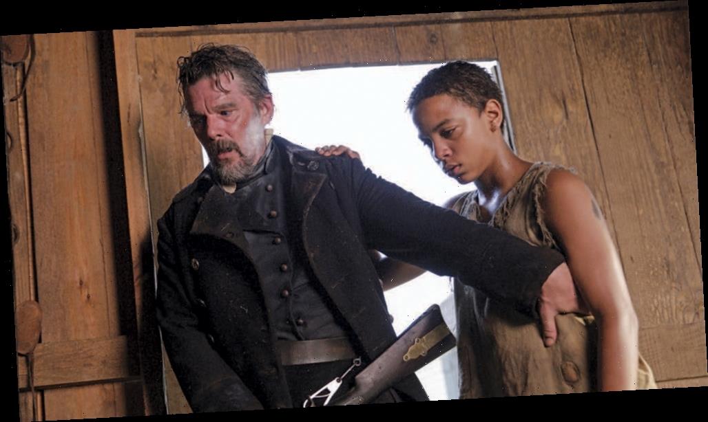
For Ethan Hawke’s “The Good Lord Bird,” the crew was asked to create a dusty rural environment to simulate the world of 1850s Kansas, in which abolitionist John Brown (Hawke) proposes the armed overthrow of slavery. Adapted from James McBride’s 2013 National Book Award-winning novel of the same name, about a young slave (Henry “Onion” Shackleford, played by Joshua Caleb Johnson) who joins Brown in his mission, the limited series, produced by Blumhouse Television, debuts on Showtime on Oct. 4.
Production designer John Blackie, Hawke and director Albert Hughes knew from the start that they wanted a palette that leaned into earth tones. “It’s almost Old West-looking,” says Blackie, whose credits include “Togo” and “Tin Star.” McBride was a writer on the show, and Blackie took his cues from the source. “The book was so concise in its description, I tried to stay with that,” he says.
Cinematographer Peter Deming (“Mulholland Drive”) credits head makeup artist David Atherton’s test sessions with Hawke for also helping to establish the period aesthetic. “David had taken a bunch of photos of Ethan, and he had this app where he added a daguerreotype look to them,” says the DP. “We gravitated to that right away.” Deming adds that the lenses he chose — vintage Panavision anamorphics from the 1960s — complemented the effect. “There was an aberration on the edges, and the depth of field was unique,” he explains.
Blackie handled the film’s multiple locations — everything from the woodsy Kansas Territory to Frederick Douglass’ house in Rochester, N.Y., to the trains Brown and some of his followers traveled on (when not on horseback). He built the sets close together, in and around Virginia. “We reused areas and locations,” he says. The interior of Douglass’ residence needed to exude a rich texture but not bounce light around that would hinder Deming’s camera. So instead of wallpaper, the designer put up fabric, which reduced the reflection when filming.
Deming notes that the look of the production shifts when the setting moves to Rochester. “Early on, the show is very much out on the plains and there isn’t a lot of color in the art direction or costume design,” he says. But for the scenes in the city, the light source changes dramatically and the costumes have more color.
The trains Brown rode on to reach his eventual destination, Harper’s Ferry, Va., were critical to showing the social strata of characters, Blackie notes. As Brown walks through the cars from cattle class, in which he and Onion are traveling, up to first class to tweak the well-heeled patrons with a fiery discourse on the ills of slavery, we go from a crowded, dimly lit space to one that’s spacious and bright. The clothing of those in first class is richer in detail and material.
“I’ve done a lot of trains, so I’m well versed in the feel,” Blackie says. “We showed poor people, rich people and middle-class people. It was important to show the class divide so you could see Onion’s struggle as he travels.”
Source: Read Full Article